Visualize 2030: Google Cloud hosts data storytelling contest with the United Nations Foundation, the World Bank, and the Global Partnership for Sustainable Development Data
Elisse Roche
Data for Good
Editor’s Note: tune in tomorrow, Tuesday September 25, 2018 at 12 PM PST/ 3 PM EST to Cloud OnAir to hear from Shane Glass, PM for Public Datasets at Google Cloud, and Andrew Whitby, Data Scientist at the World Bank, on the applications of public datasets and data visualizations within the public sector, and how higher-ed students can enter the Visualize 2030 contest.

Visualize 2030 is a data storytelling contest for university students, hosted in partnership with the World Bank, the United Nations Foundation, and the Global Partnership for Sustainable Development Data. We’re inviting students at the college and graduate level to use Google Data Studio to analyze datasets from the World Bank and the United Nations, and tell a data story about the UN’s Sustainable Development Goals. If you’re an actively enrolled student, learn more and apply here.
NGOs, IGOs, and nonprofits are increasingly turning to data analytics and machine learning to achieve their missions at scale, exploring partnerships and opportunities for collaboration with the private sector. At the core of this burgeoning “data for good” movement are interdisciplinary and international partnerships, bringing private and public sector organizations in order to apply modern technology to the world’s greatest challenges.
One such opportunity for collaboration is public datasets. Google Cloud launched its Public Datasets program in 2016 with the intention of facilitating access to data and furthering knowledge, migrating 100+ datasets that are analyzed around the world. For each dataset, Google Cloud covers the migration and storage costs at no charge, allowing any user with a valid GCP account to query up to 1 TB per month—again, at no charge. Across our BigQuery datasets, from NOAA’s GSOD to the EPA’s Historical Air Quality records, the total data volume queried is over 100 petabytes. It’s also worth noting that verticals like climate, health, and economics in particular can help nonprofits jumpstart their data analytics projects and advance social causes.
These data points function much like a vocabulary: to make sense of them, you must string them together in a cogent sentence. Otherwise, like words themselves, metrics exist only in their own right, in tightly circumscribed definitions and etymologies. Such sentences can be strung together in tables, groups, and joins, evolving into smooth paragraphs that, all at once, begin to tell a story. This story can be illustrated—that is, visualized. Data visualizations are another useful resource for mission-driven organizations looking to implement data analytics, facilitating a synthesized and persuasive communication of insights. With Google Data Studio, anyone can create interactive dashboards or reports from BigQuery and more than 500 other data sources through Data Studio’s community connectors ecosystem, at no charge. While one nonprofit, like the Foundation for Precision Medicine, may use Data Studio to visualize sensitive medical information without leaving a secure cloud environment, another organization, like Harambee Youth Employment Accelerator, may use it to better synthesize their data and match unemployed youth with jobs in South Africa. Any organization can tell the story that will serve their purpose, support their community, or even change the world.
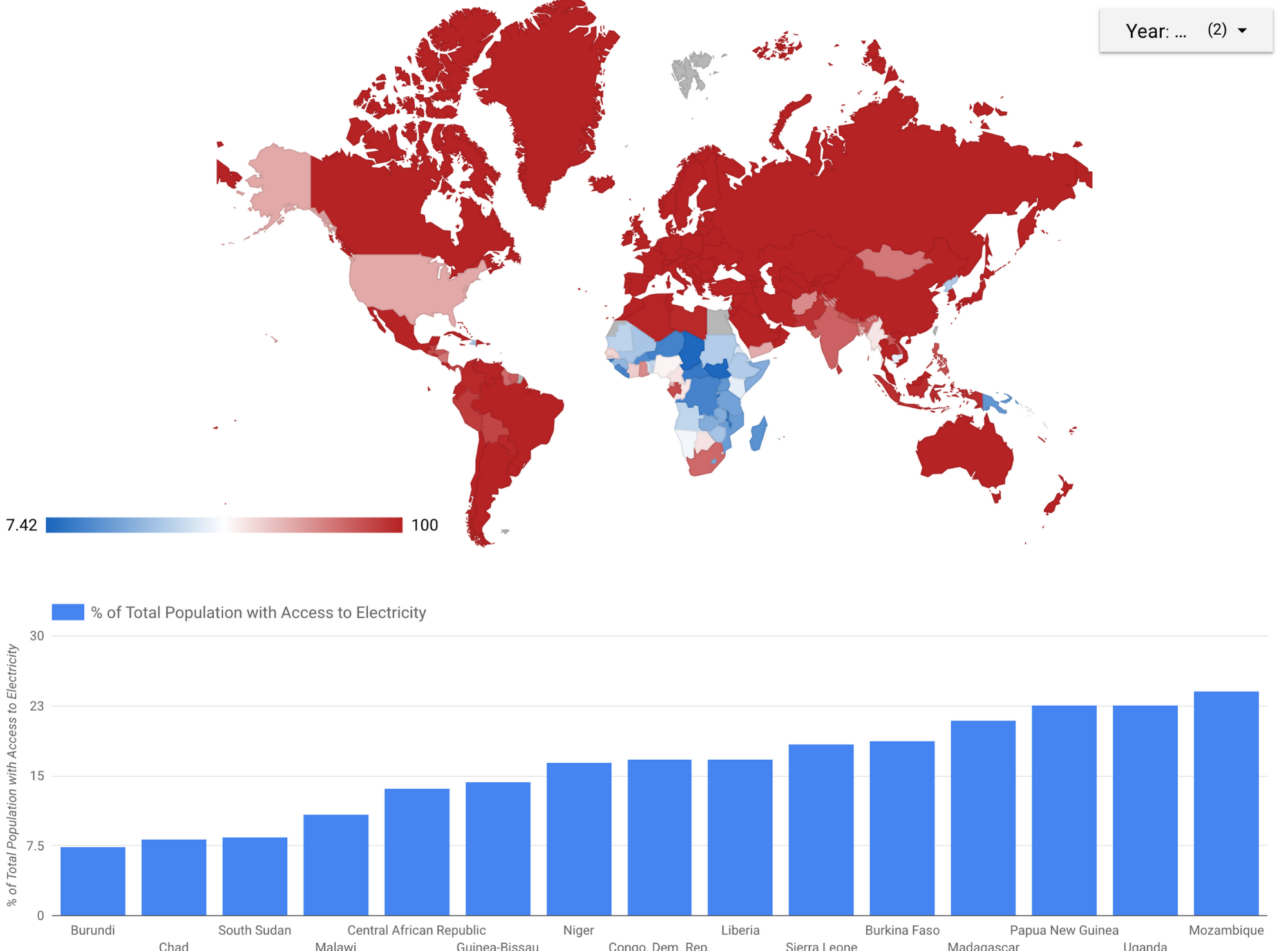
It is with this optimism that we launched another initiative in July of 2018: Visualize 2030 | Data Stories for the SDGs (Sustainable Development Goals). In partnership with the United Nations Foundation, the World Bank, and the Global Partnership for Sustainable Development Data, we’re encouraging students at the higher-ed level to analyze datasets and tell a data story about the 2030 Agenda, comprised of 17 Sustainable Development Goals (SDGs). These SDGs were determined by the United Nations and range from preserving biodiversity to ending poverty. Specifically, we’re asking students to analyze newly migrated public datasets from the United Nations Statistics Division and the World Bank, and to use Data Studio to tell a data story about how at least two SDGs influence each other and how we can achieve them by 2030. We hope that, working together, we can inspire the next generation of data scientists to take action and join the data for good movement. If you’re an enrolled university student interested in learning more about Visualize 2030, visit cloud.google.com/visualize-2030.
In this spirit of interdisciplinary collaboration, we will be attending the Global Goals Week taking place this week around the UN General Assembly in New York City. Rebecca Moore, Director of Google Earth Engine, will be representing Google Earth and Google Cloud at the session titled “Big Data for Better Lives: Mobile, Statistics, & Insights” on September 25th, alongside representatives from organizations like UNICEF and the World Food Programme (WFP), and also at the SDG Media Zone on September 27th to speak on sustainability and the SDGs.