GlideFinder: How we built a platform on Google Cloud that can monitor wildfires
Dmitry Kryuk
Founder & CTO, GlideFinder
Editor’s note: Today’s post comes from Dmitry Kryuk, Founder & CTO, GlideFinder, which offers a platform that can locate wildfires, alert subscribers, and provide analytics that can help contain wildfires in a timely manner.
The last decade has demonstrated that climate change is not an abstract concept—it’s something that’s happening now, and is already translating into multibillion damages, business bankruptcies, and lost property. We founded GlideFinder with a long-term goal to help prevent major uncontrolled wildfire, and we firmly believe that applying knowledge and insights from a variety of data sources can have great impact in controlling and managing the effects of these natural disasters.
Understanding risk exposure is an important way businesses and communities can prepare for the possibility of wildfire, and a key component of estimating that risk is the availability of a reliable real-time fire detection and notification framework. But creating such a framework has historically been challenging because it requires bringing together a wide variety of raw datasets from various agencies, and then the training, domain knowledge, and time and resources it takes to make sense of that data. As we developed GlideFinder, our aim was to create a framework that could easily help users understand which preventative measures would be most efficient and cost effective for their specific location. Because this problem is much more severe in developing countries, it needed to be affordable and scalable as well.
To address some of these challenges, we built a public platform for detection, notifications and analytics of wildfire risks. It correlates streaming satellite data with supplemental weather, geologic, terrain, demographic, economic and agency response data, visualizes fire development on an interactive map, gives a sense of how fast the fire is spreading and in which direction, and can help define proactive long-term planning and short-term emergency response procedures. In the future, the platform can be extended to other natural phenomena observable from space, UAVs, cameras and sensor networks.
Building GlideFinder On Google Cloud
Since Glidefinder is an analytical platform, it needs data, and acquiring high quality data was the biggest challenge. There are multiple agencies that collect data in different formats, sometimes on paper, at varying levels of detail. That’s why the focus so far has been the integration of satellite data, which is factual, reliable, and consistent in resolution over time.
Scalability
GlideFinder currently ingests data from the NASA Suomi NPP satellite, VIIRS, and historical MODIS data. The satellite generates on average 50,000 records per day, which are updated every hour. Each record represents a hotspot of 375mX375m with characteristics like temperature, data quality, and more. There are approximately 200 million records, or 22 GB of data for the VIIRS/MODIS dataset. Right now, we’re in the process of integrating geostationary satellites GOES-16 and GOES-17, each running a new scan every 5-15 minutes. We’ll have roughly 210 GB of data for a single year.
All this data is stored in Cloud Storage and BigQuery. When a user runs a search for a particular location, they define a few search criteria:
Level of aggregation—It could be annual, monthly, daily, or not aggregated at all.
Time range
Zoom level—The defined area around the location search to present on the map. The default is 40kmX40km, but you can increase or decrease that area so that, in conjunction with other criteria, you can control the amount of data you pull.
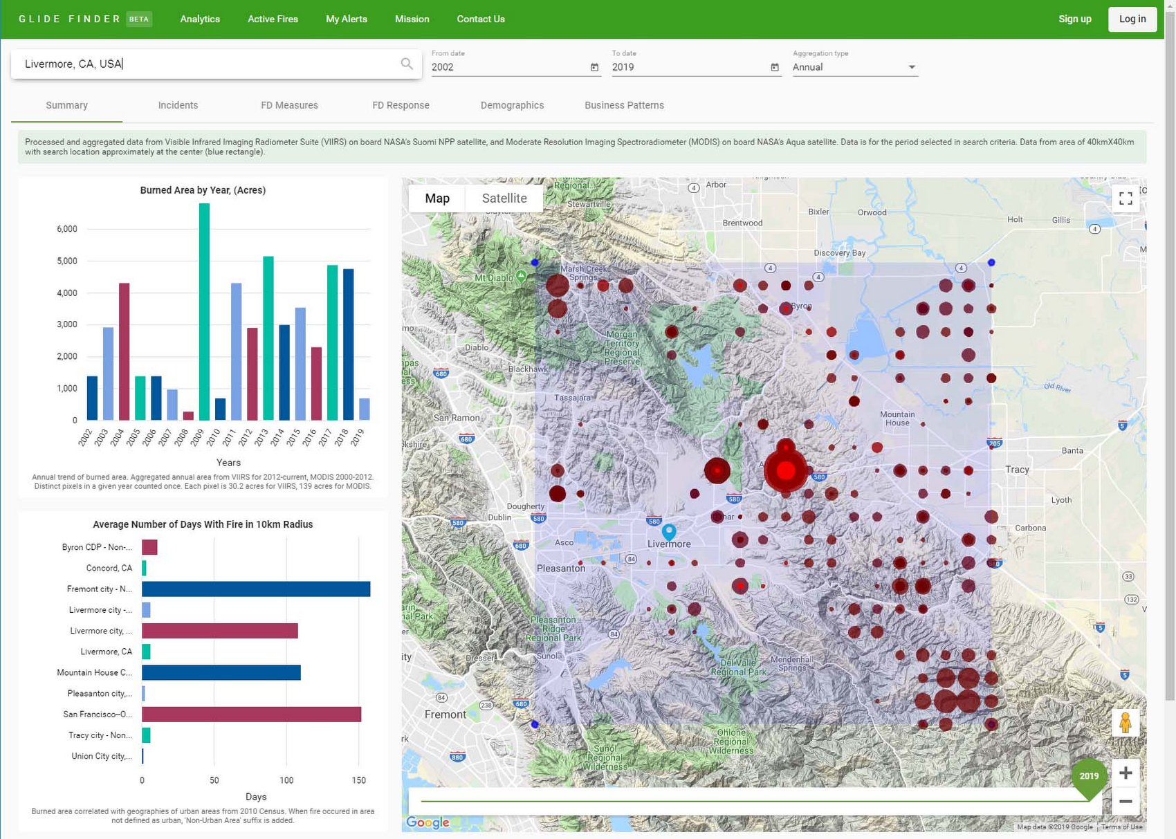
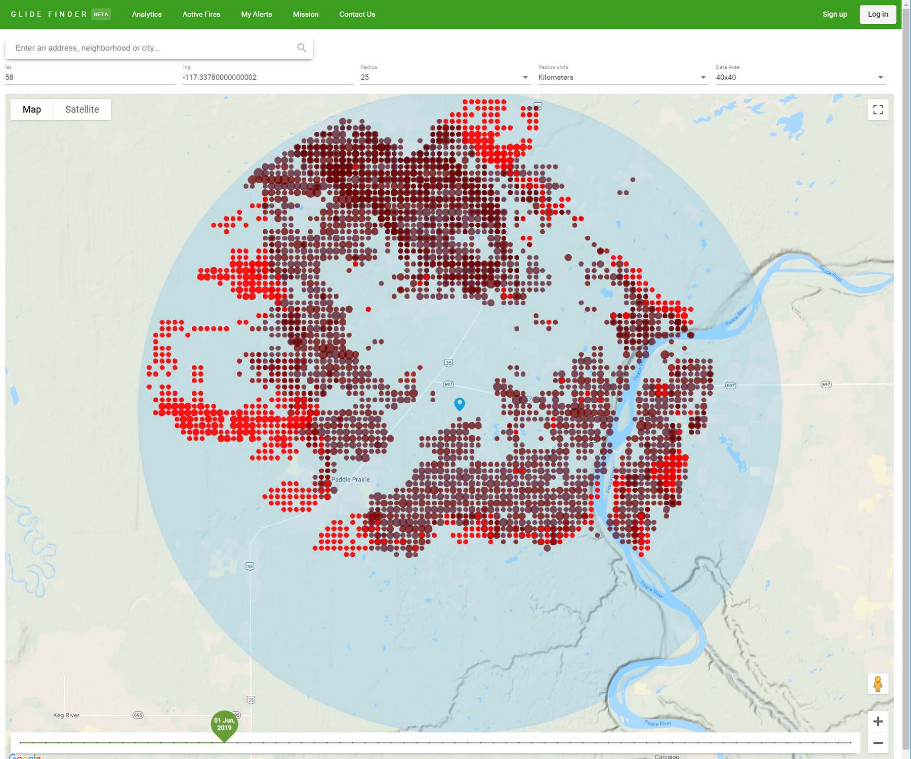
The results include metrics like total burned area for the selected time range, zoom level, aggregation level by year, county, and number of days the fire was in the radius of 10km, by city or zip code. Here’s what it looks like:
We can’t run this query against BigQuery directly for the following reasons:
In general, BigQuery has a default of 100 concurrent interactive queries per project, and we can expect hundreds of thousands of concurrent users during fire season from all over the world.
Even if this solution was built for mid-size enterprise customers with a few hundred users, querying BigQuery directly would take a significant amount of time. We use multiple aggregate functions, joint with city/county/international administrative unit geographies, so a single query can run for a few minutes.
To solve this problem, we materialize the views with the required business logic and use a Dataflow job to process that data and write into JSON files in Cloud Storage and Cloud Firestore.
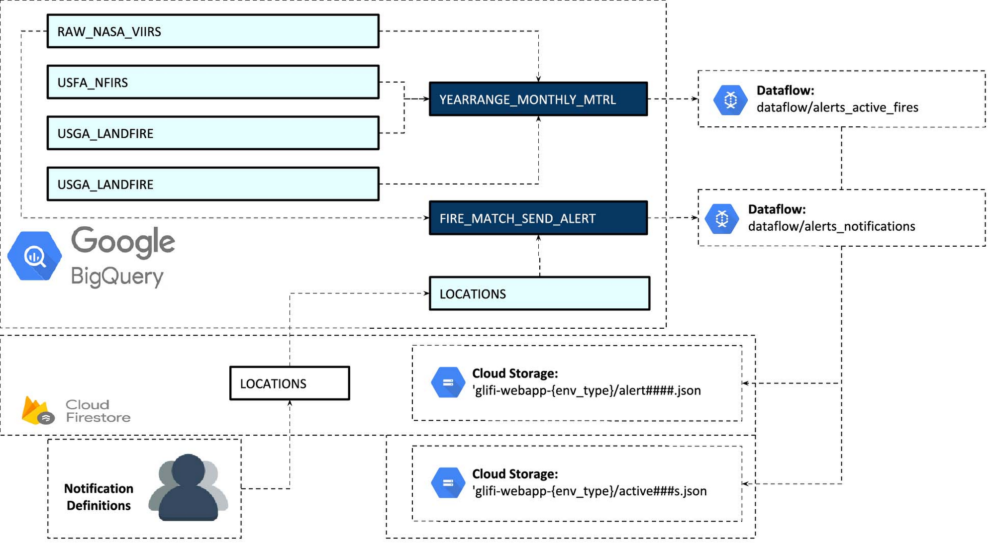
The filenames contain location coordinates and period name. E.g.
That link means that we are pulling historical data for an entire year (2012), with monthly aggregation (there will be 12 nodes in a single JSON file). Coordinates 12.5405_-13.9194 define a corner of a 20kmX20km square.
We also separate processes for dealing with historical data and incremental real-time data. Once the business logic is defined, we can run Dataflow processing once for the entire history, and then append current year/month files.
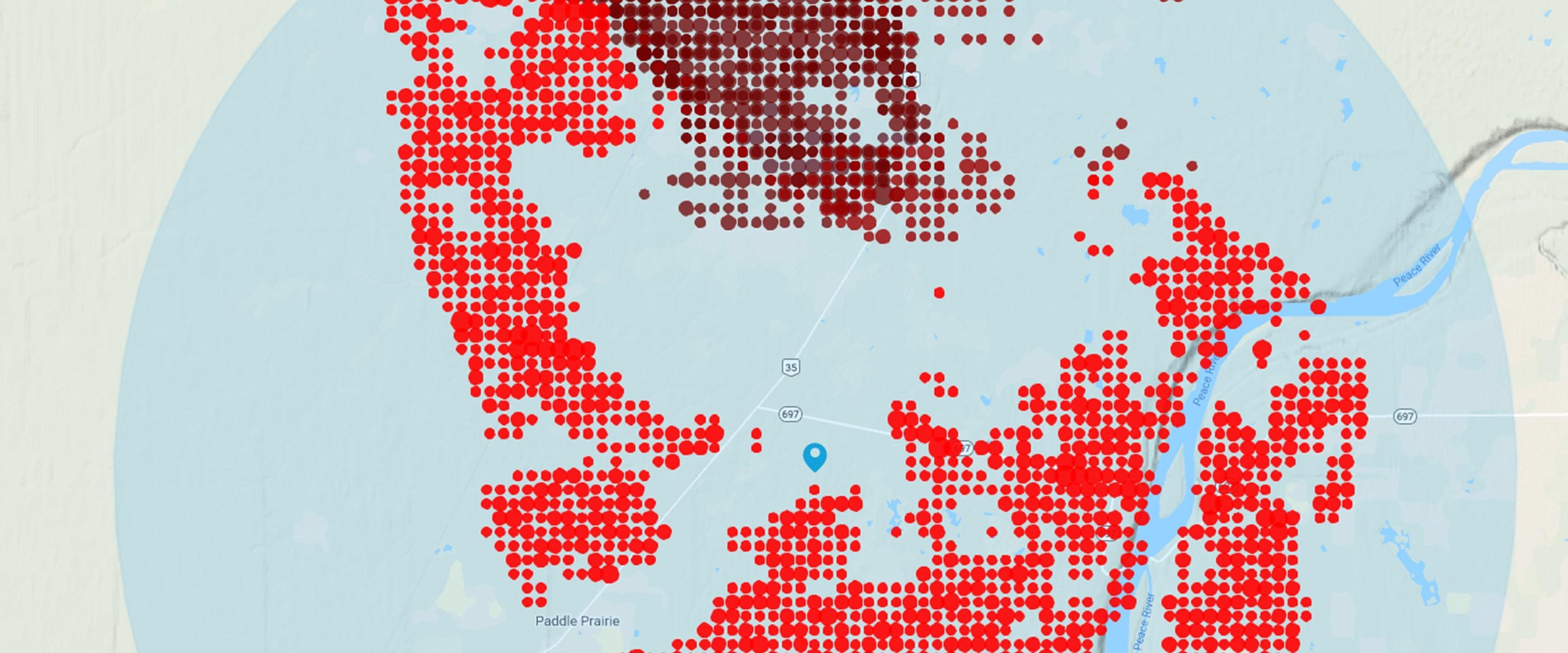
We do something similar with real time data: we create JSON files that span a window of the current fire season (for example the last 5 months). Those files are stored in a different location and demonstrate propagation of the current fire. The data is not aggregated by time, and shows hotspots from every satellite scan in the timeline. We use streaming Dataflow pipelines to process new incremental fire data and new alert locations that subscribers add to monitoring.
Red dots correspond to the current position on the timeline. The darker spots are from previous scans.
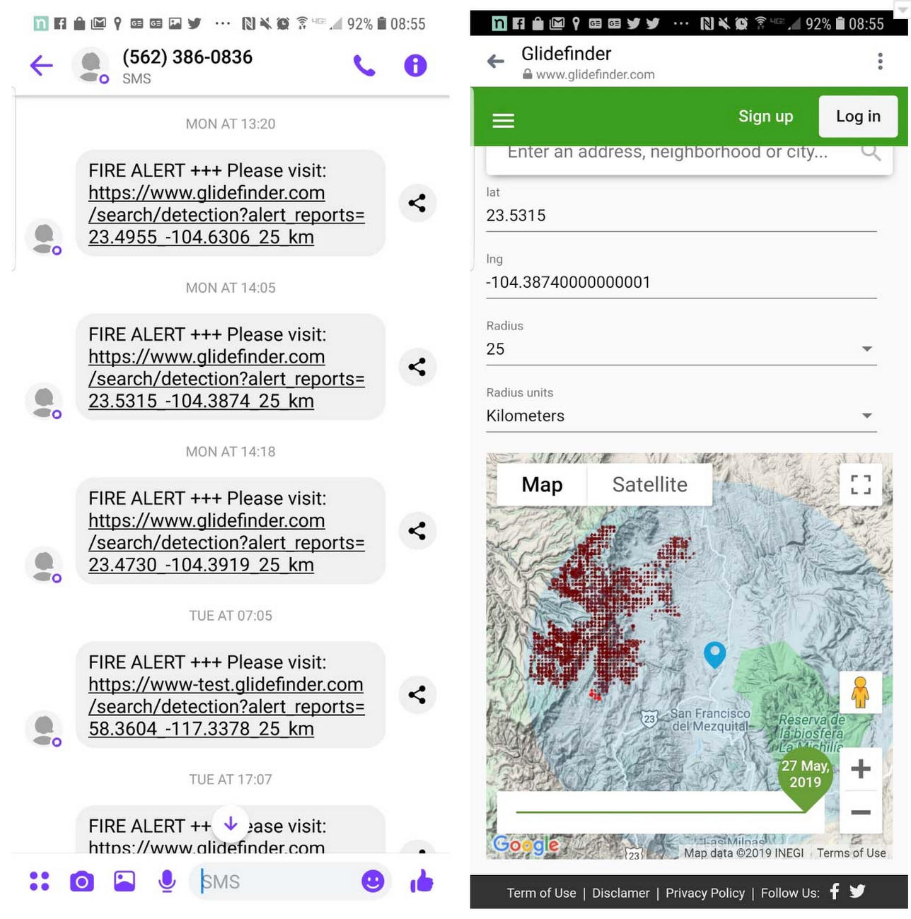
Since subscribers can add new locations for monitoring all the time, and we are still bounded by the default of 100 concurrent queries, new alert configurations are exported every 3 minutes from Firestore to BigQuery. This way, a batch of locations is processed by a single query. When a match between an alert location and fire data is found, a cloud function materializes the view and triggers Dataflow which writes report files and JSON files that define the customer and which notification method to use. Once the file lands in the bucket, it triggers a cloud function that uses a third-party API to send an email or SMS.
This is how alert and interactive map looks on the mobile:
Geographic Aggregation
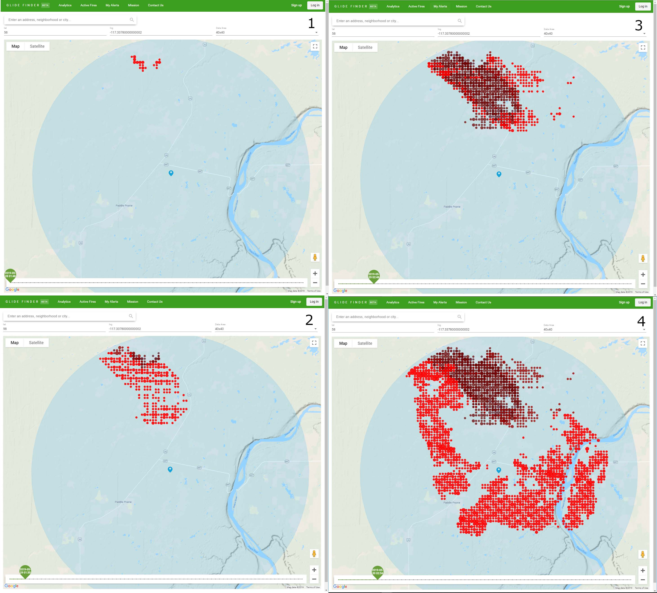
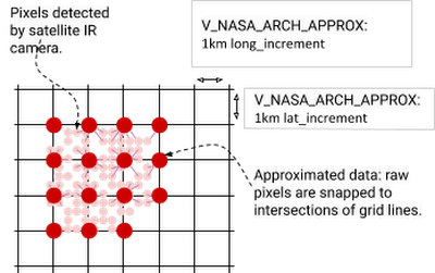
One question that arises from processing and visualizing satellite data is how to do it efficiently without jeopardizing accuracy. VIIRS resolution is 375x375m, and large fires have multiple adjacent pixels. Different scenarios may require different accuracy: if we are presenting a fire that is happening right now, we may want to present every hotspot on the map from each scan.
When we present aggregated annual data, in most cases it would not make sense to present every hotspot. We can’t use DISTINCT in the query since the coordinates are float numbers, and the 375x375 pixels may overlap between scans.
To work around this, multiple pixels can be snapped to another point in the intersection of a grid.
The query below does it with latitude:
Why only latitude and not longitude? Because every latitude line is about the same length in km, but the further you move from the equator, lines of longitude become shorter. Hence for long_increment we use a trigonometric formula:
GIS Formats
In addition to the satellite data, our platform also uses several GIS datasets such as vegetation types, vegetation disturbance (e.g., insect infestation), and potential fire intensity, as well as information about who is responsible for administering each area. We join those datasets with fire data, so that we can tell in which zipcode/province/region the fire has occurred, compare metrics from different geographies, and estimate the risk of fire based on the availability of fuel. We also use public dataset bigquery-public-data:geo_us_boundaries for US counties, cities, zip codes and join with US Census data.
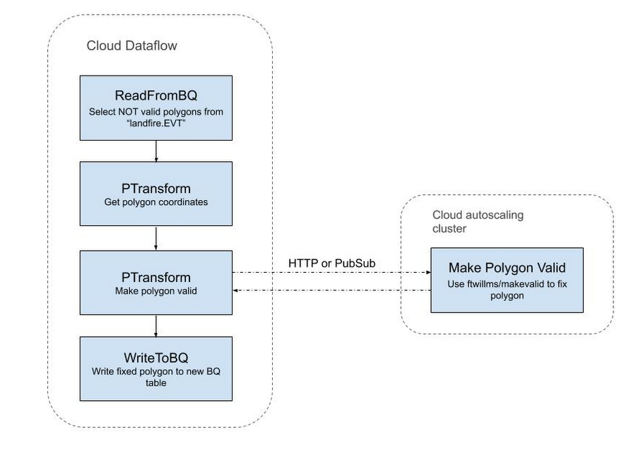
The GIS source is usually in shapefile format, which can be converted to GeoJson with the open source ogr2ogr utility. The problem is that when those files are created in ESRI or other specialized GIS tools, they have less restrictions on the types of geometries than currently in BigQuery. So unless we use the SAFE prefix, the query that uses GIS functions will fail. Usually there’s a small percentage of erroneous polygons, but sometimes those are the largest polygons. In the SRE dataset, one of those polygons covered most of California.
To overcome this issue, we used the following workaround:
Export erroneous polygons from BigQuery:
Upload exported polygons into PostGIS and fix them there:
However, that operation is computationally intensive. For example, a single table of vegetation types contains 782M polygons (281GB), of which 10M are invalid polygons. Fixing them on a single machine would take days. In this case, Dataflow came to the rescue again: we created an autoscaling data pipeline that employed GIS utilities to fix the polygons.
Summary
We chose Google Cloud infrastructure because of its scalability (which allows millions of concurrent users from anywhere in the world), live data streaming and processing with Dataflow, and the ability to work with petabytes of data in BigQuery. We are also planning to use Vision API and machine learning to process imagery data from cameras and additional satellites.
Below are the main GCP components we use:
BigQuery data warehouse—For historical and real-time satellite data, census datasets, USGS fuel and vegetation data, USFA fire response data, and user location data. User data is correlated with detection data, and based on that information alerts are sent.
App Engine with Cloud Tasks and background Cloud Functions—used to pull data from NASA sources, detect events such as new data files, materialize BigQuery views on events, send alerts, publish Pub/Sub messages, and write user-specific data into Firestore.
Dataflow—streams new user and satellite data into BigQuery, picks up the results of BigQuery views and writes them into Google Cloud Storage for user consumption.
Pub/Sub messaging—Triggers Cloud Functions.
If you have questions or recommendations about our platform, or would like to help us in development, please reach out to dmitry@glidefinder.com.